A country, introduced
before it is sold.
Most travel sites are built to take a booking. This one is built for the step before that — someone who has heard of Bhutan, is curious, and has not yet decided to go.
Visit the website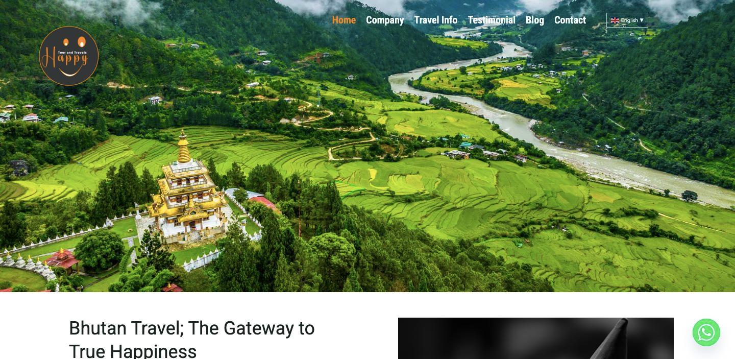
A tour operator whose hardest job is explaining where they are
Happy Tour and Travels run trips in Bhutan. Their difficulty is not competition — it is that most people considering the trip know very little about the country, and a site that opens with itineraries and prices is answering a question the reader has not reached yet.
So the brief was closer to a magazine than a shop: show the place well enough that someone decides they want to go, and make the enquiry easy once they have.
Designed as a piece, then built to be handed over
Design first, decide the platform after
The layouts, the typography and the way a journey unfolds down the page were settled before a line of it was built. Doing it the other way round - picking a theme and arranging content inside whatever it allows - is how travel sites end up looking like each other, and Bhutan is not a country that should look like anywhere else.
Lead with the place, not the offer
Someone reading about Bhutan is usually deciding whether to go at all, not comparing prices. So the homepage opens on a full-bleed valley rather than a booking widget, and every page is built to be read. The enquiry is there when the reader is ready for it, and not before.
Six journeys, not one list of tours
The same country reads differently depending on why you are going. Culture, trekking, festivals, mountain biking, motorbiking and luxury each get their own page with their own photography, so a reader recognises their trip instead of scrolling a single undifferentiated catalogue.
Hand it over on WordPress
The design was then implemented on WordPress, because the people running it write about festivals and seasons and needed to publish without calling anyone. Fourteen destination guides have gone up that way. The site is theirs to run.
Six ways to see the same country
Each has its own page and its own photography, so a reader finds the version of Bhutan they came looking for rather than filtering a list.
Read in four languages
English, German, Korean and Thai — which is not a guess about who might come, but a reflection of who actually does. Bhutan draws visitors from a handful of specific markets, and the site meets them in their own language rather than assuming English.
A platform the client can actually run
WordPress was chosen for the handover, not for the build. A travel business writes about seasons and festivals as they happen, and needs to publish without booking a developer to do it.
Selling something people have to understand first?
That is a design problem before it is a development one. Tell us what you are trying to explain.
Book a discovery call